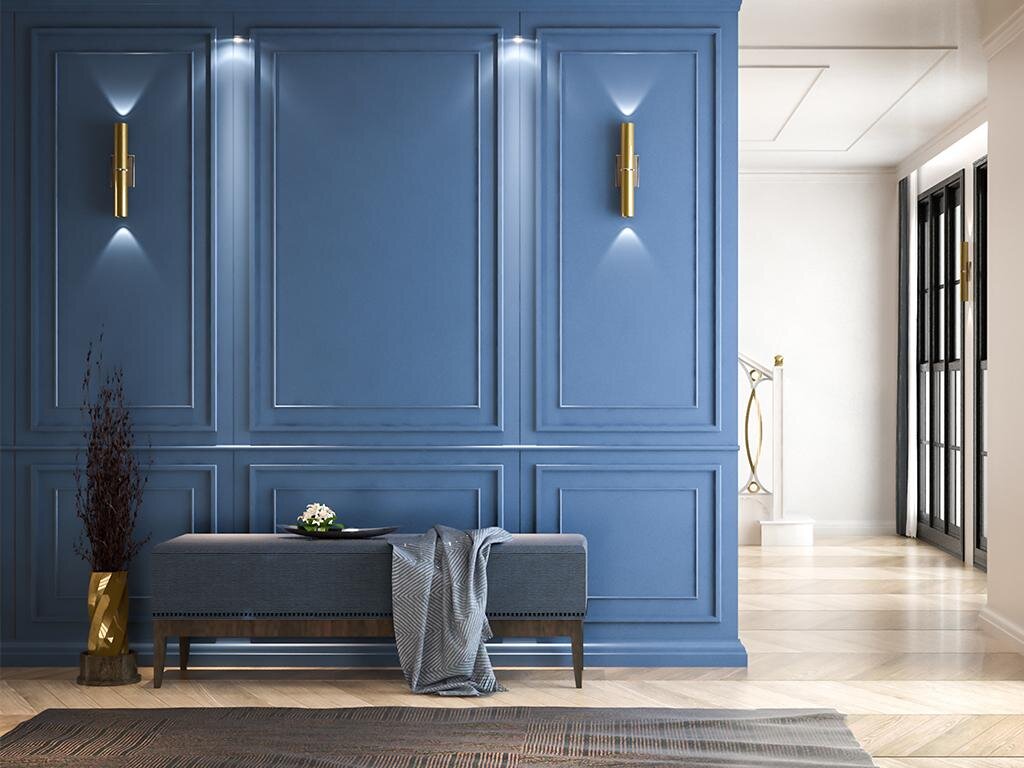
Classic Blue: Pantone’s 2020 Colour of the Year!
After much speculation and anticipation, colour communications expert Pantone has announced its Colour of the Year - Classic Blue.
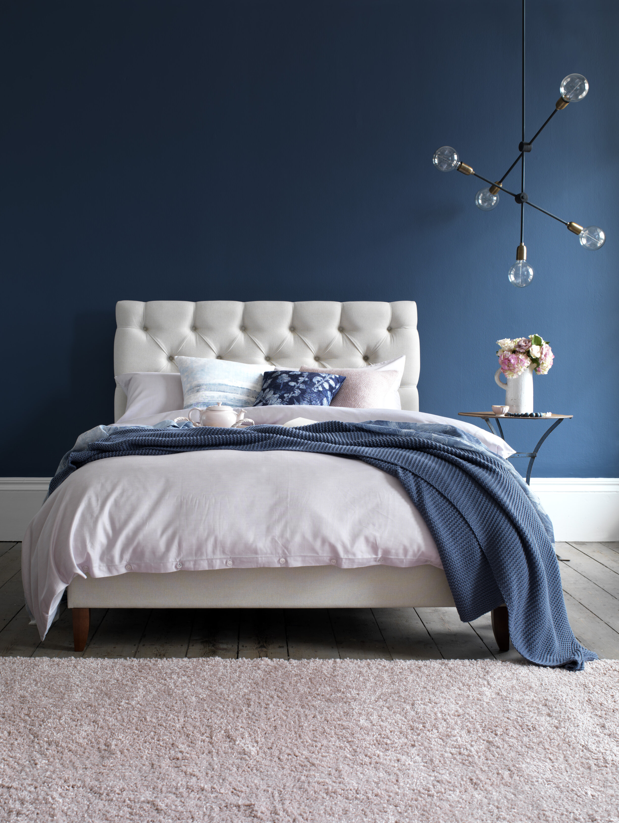
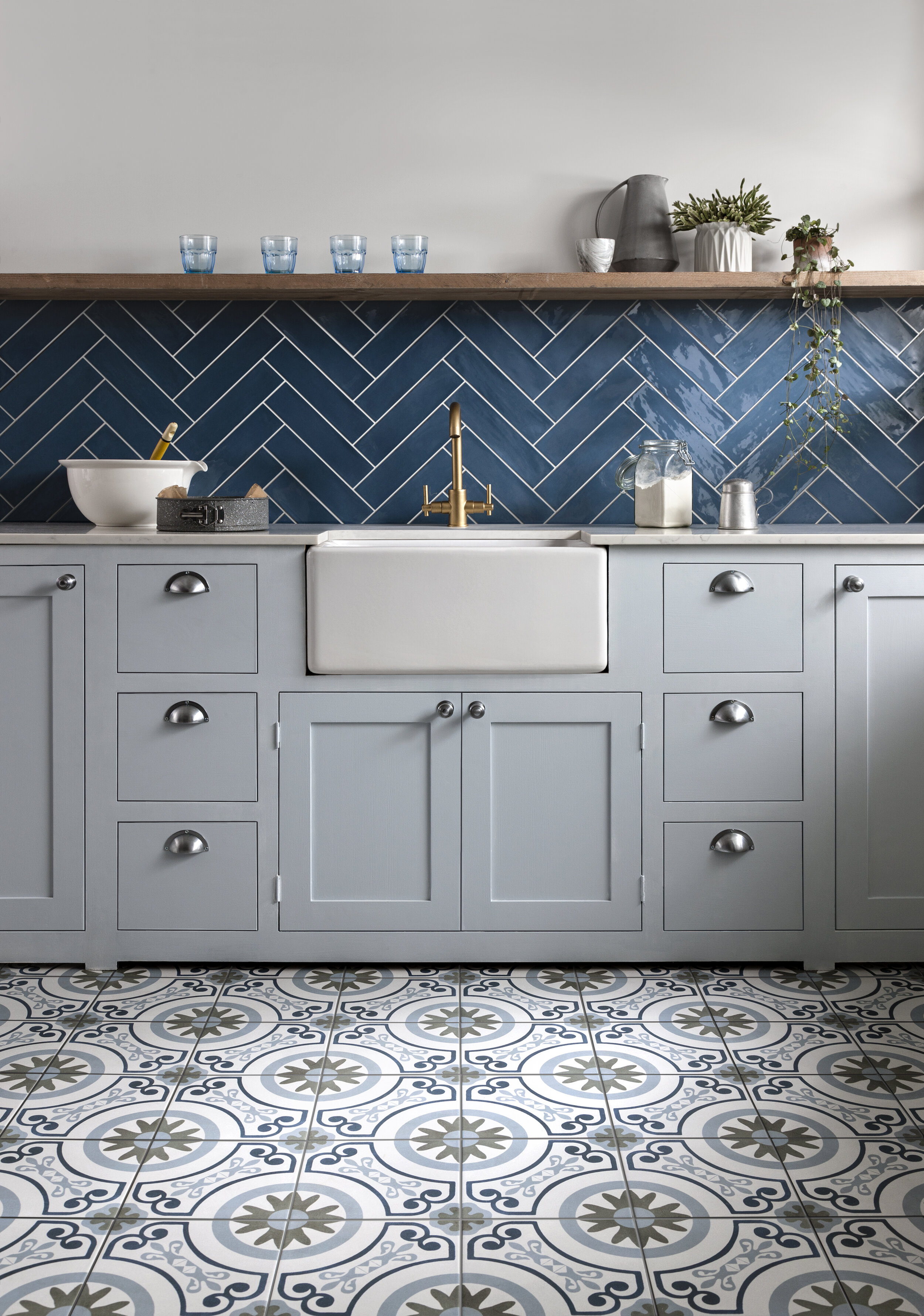
Personally, we love this choice - elegant and simple, blue is one of those universally loved colours that’s suitable for all kinds of applications and can evoke both warm and cool moods, especially when used in interior design.
“Instilling calm, confidence and connection, this enduring blue hue highlights our desire for a dependable and stable foundation on which to build as we cross the threshold into a new era.”
Acting as an antidote to today’s landscape, with its controversial politics, evolving technologies and fast-paced lifestyles, blue is a grounding colour that will see us through 2020 as we cross the threshold into a new decade.
Reassuring, peaceful and tranquil, Classic Blue is a comfortable and familiar shade that is credited with aiding concentration, bringing clarity and fostering resilience.
“Imbued with a deep resonance, Classic Blue provides an anchoring foundation. A boundless blue evocative of the vast and infinite evening sky, Classic Blue encourages us to look beyond the obvious to expand our thinking; challenging us to think more deeply, increase our perspective and open the flow of communication.”
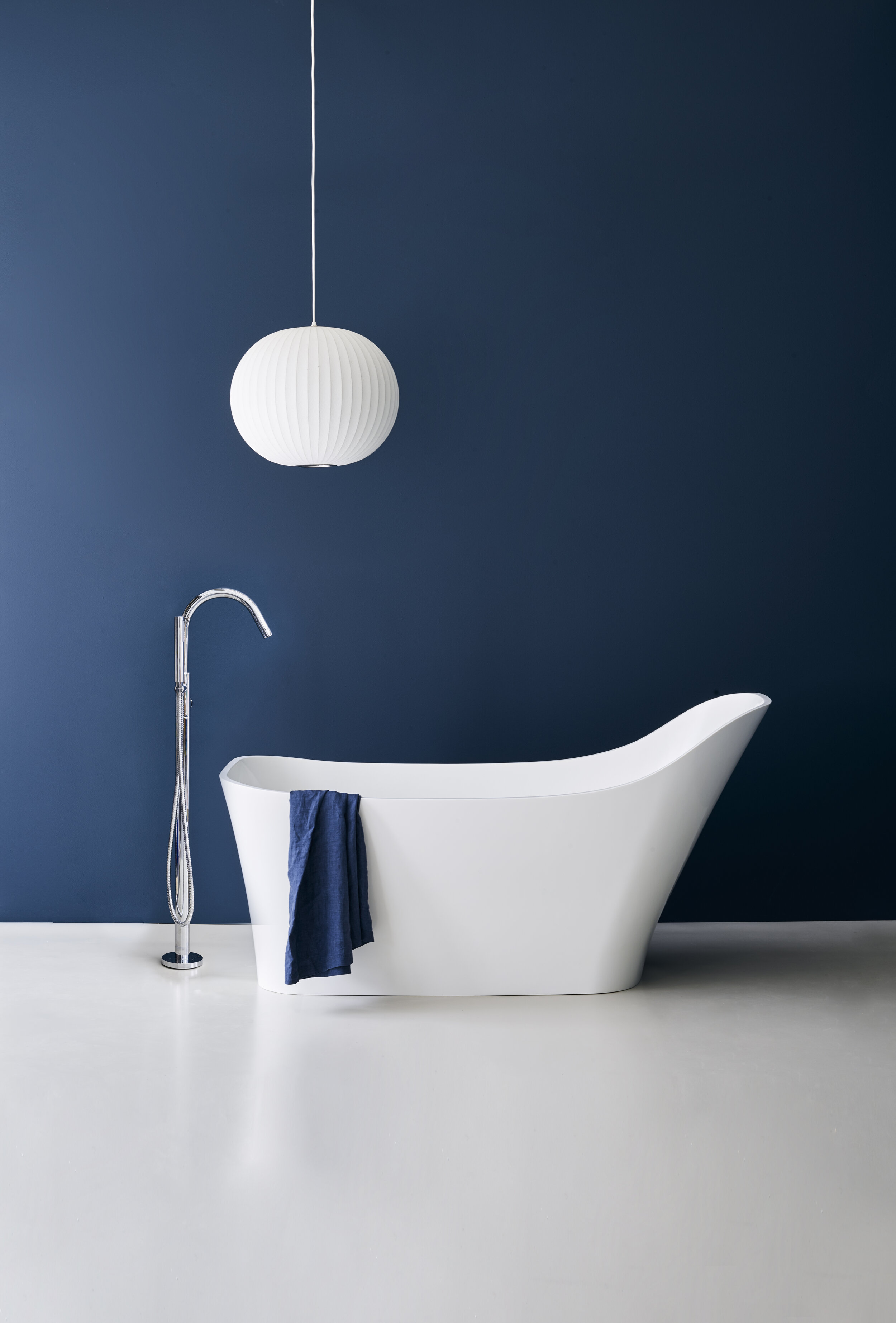
One of the strongest hues of the colour spectrum, blue is believed to bring down blood pressure and slow respiration and heart rate. Deep, bold shades are effective at creating a sense of confidence and are linked to traits such as loyalty, trust and success. Considered calming and serene, this colour is often recommended for bedrooms and bathrooms where you want to create a relaxing environment.
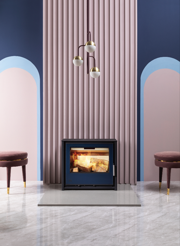
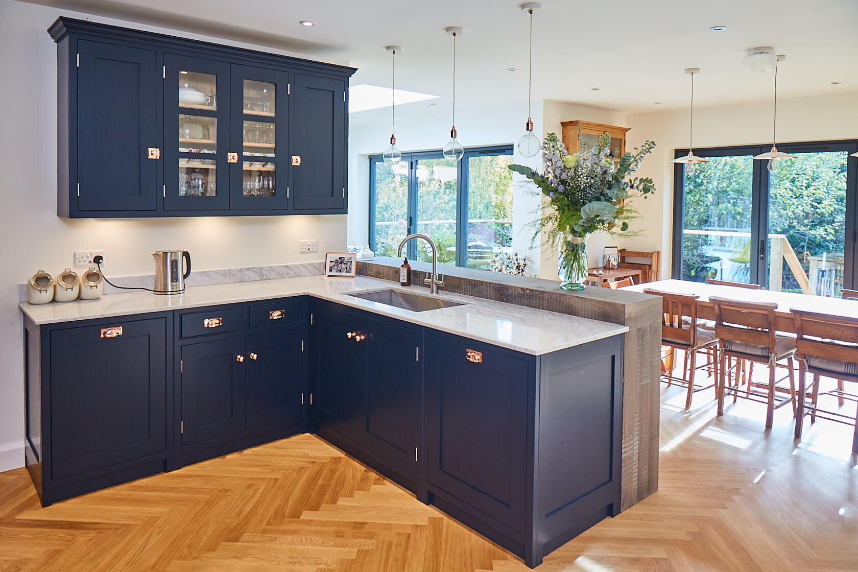
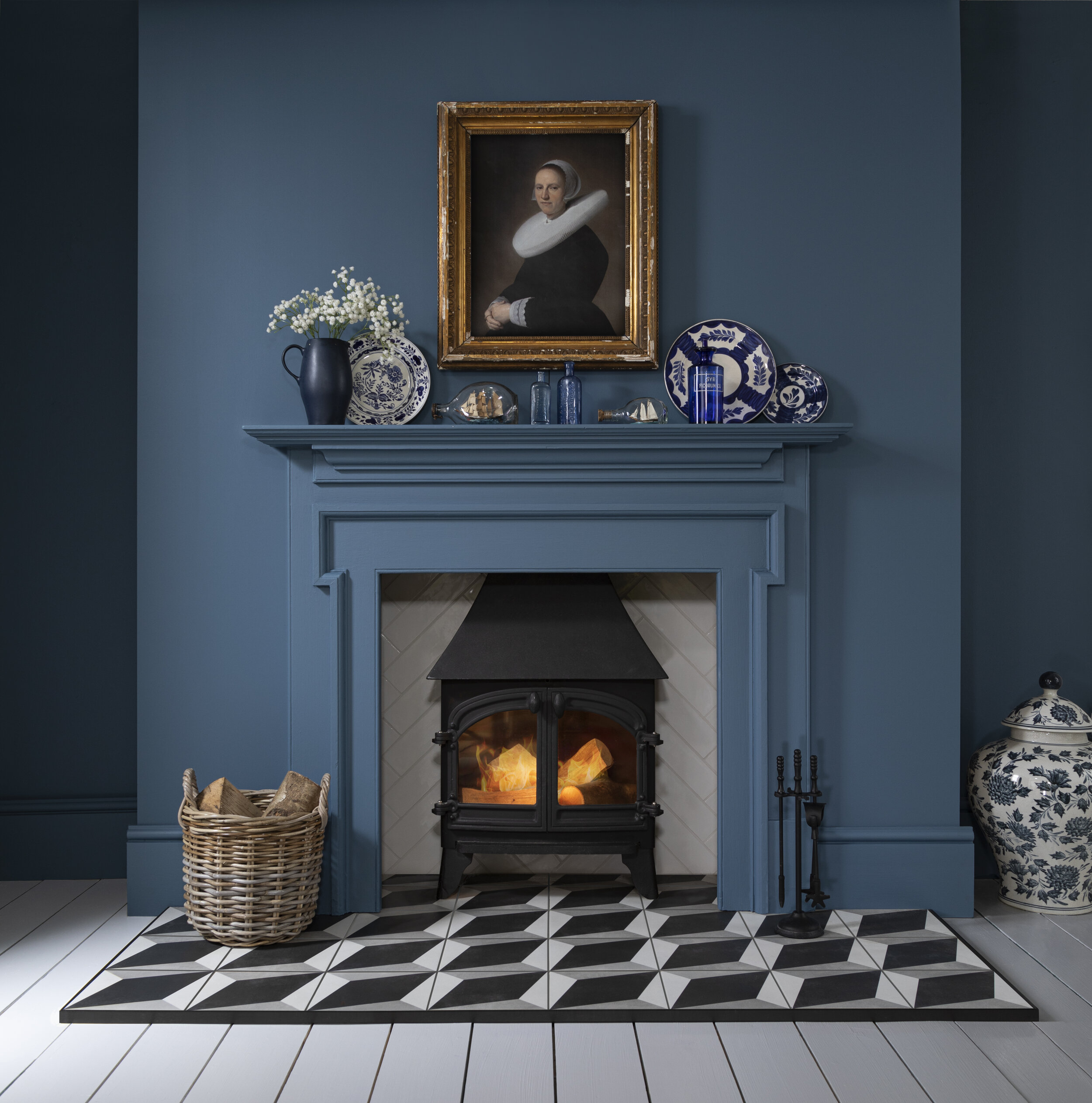
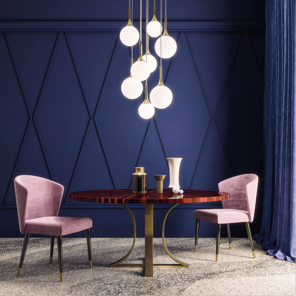
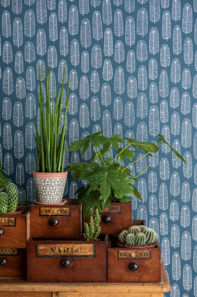
For the ultimate style statement in your home, team Classic Blue with crisp whites, brass finishes and plenty of natural greenery to transform your tired décor into a stunning interior design for the new decade!
Alternatively, keeping it simple and just adding quick blue décor such as dining chairs, tables, lamps or picture frames is just as effective in creating a serene living space.
As part of its marketing campaign, Pantone partnered with several brands to develop the smell, sound, taste and texture of Classic Blue. The resulting package included a swatch of suede-like soft fabric, a musk-and-sea-salt scented candle, a blueberry flavoured jelly, and a three-minute audio track titled “Vivid Nostalgia”. In fact, its Colour of the Year became a complete consumer experience!
We find this a really interesting way to consider colour and the impact it has on our other senses, especially when thinking about how interior design is intrinsically linked to our mood, with colour having a direct effect on our psyche. What do you conjure to mind when you think of the colour blue?


