
How To Apply Colour Psychology To Your Interior Designs
Have you ever considered why you feel more relaxed after spending time in a neutral, light space? Or energised after being in a colourful, vibrant room? It’s probably largely down to colour psychology (the connection between our emotions and colour), making a huge impact within interior design schemes.
Colour psychology is a powerful interior design tool that impacts the mood of a room more so than any other factor. Different shades evoke certain emotions so, when choosing your colours, it’s important to consider the kind of atmosphere you wish to create and which colours will help you achieve this.
Whether you’re looking to add the odd pop of colour or decorate your entire room, discover the psychological effect of colour in interior design with our help:
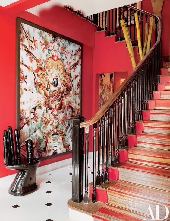
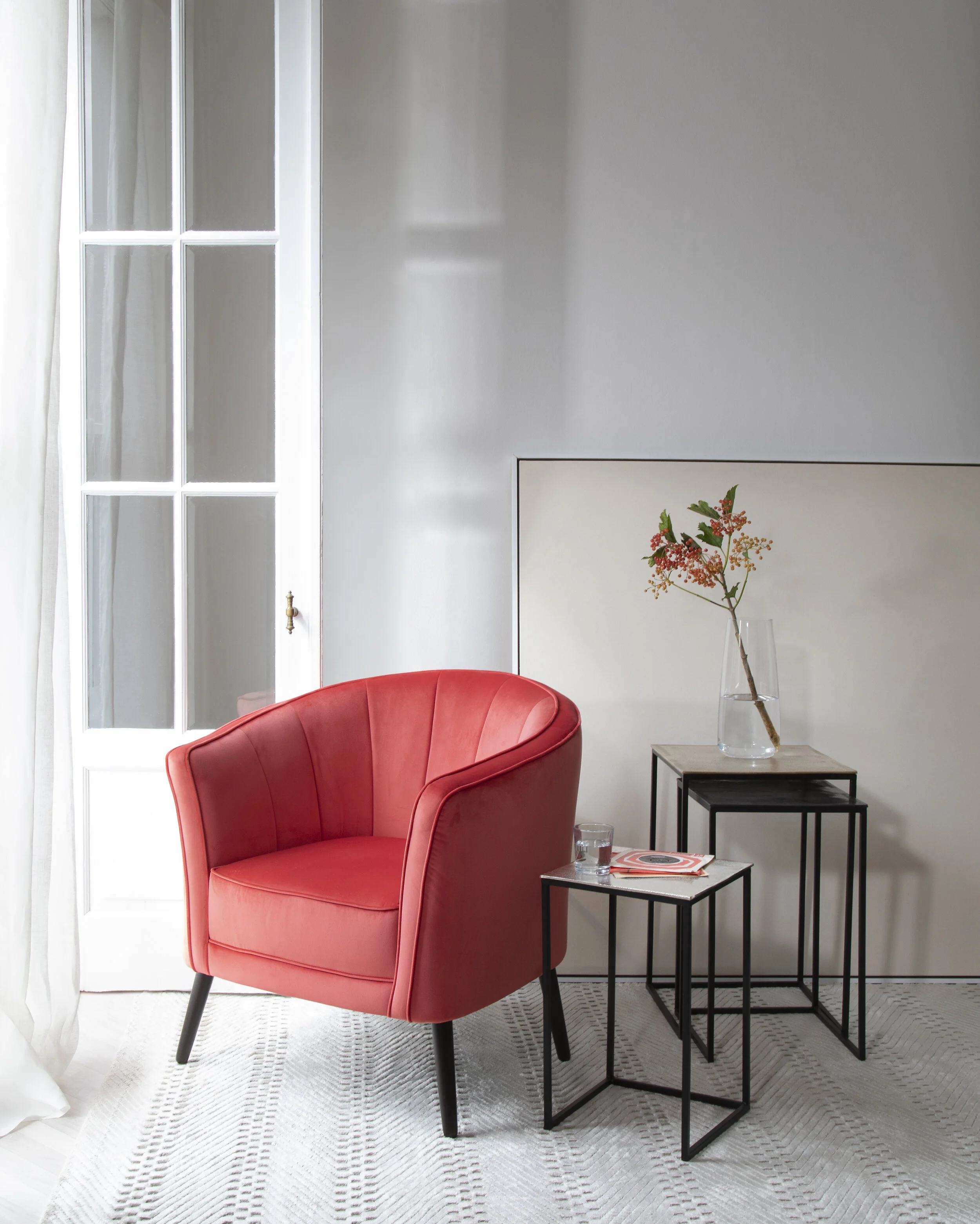
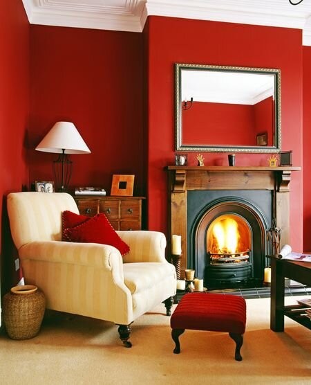
RED –The most intense colour, red raises a room’s energy level and pumps the adrenaline. Ambition, action and willpower are all qualities attributed to this colour, which is why red is a great option for home offices and creative spaces. In the living or dining room, red draws people together and stimulates conversation. In an entrance hall, it creates a strong first impression.
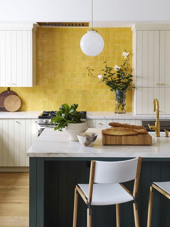
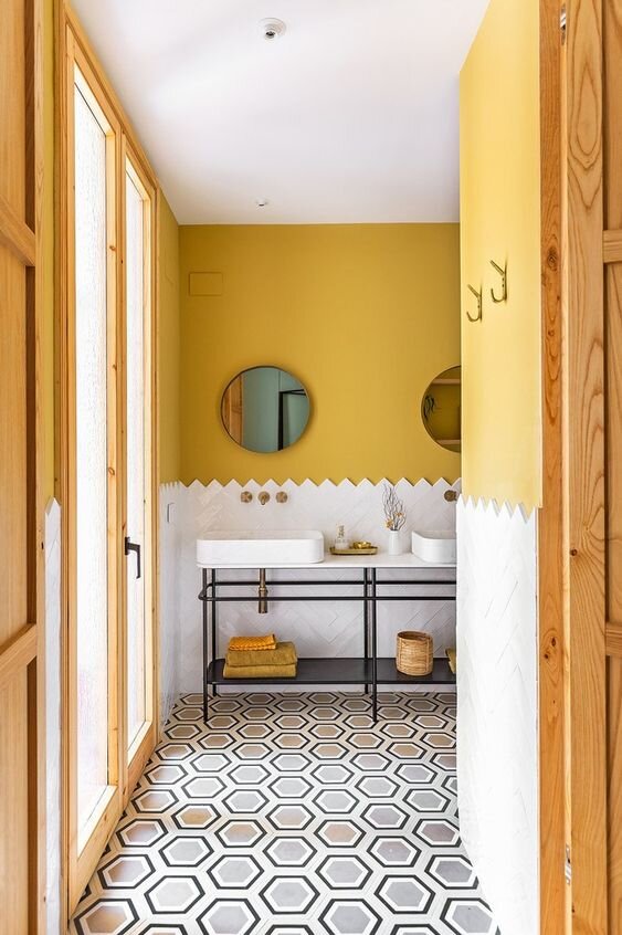
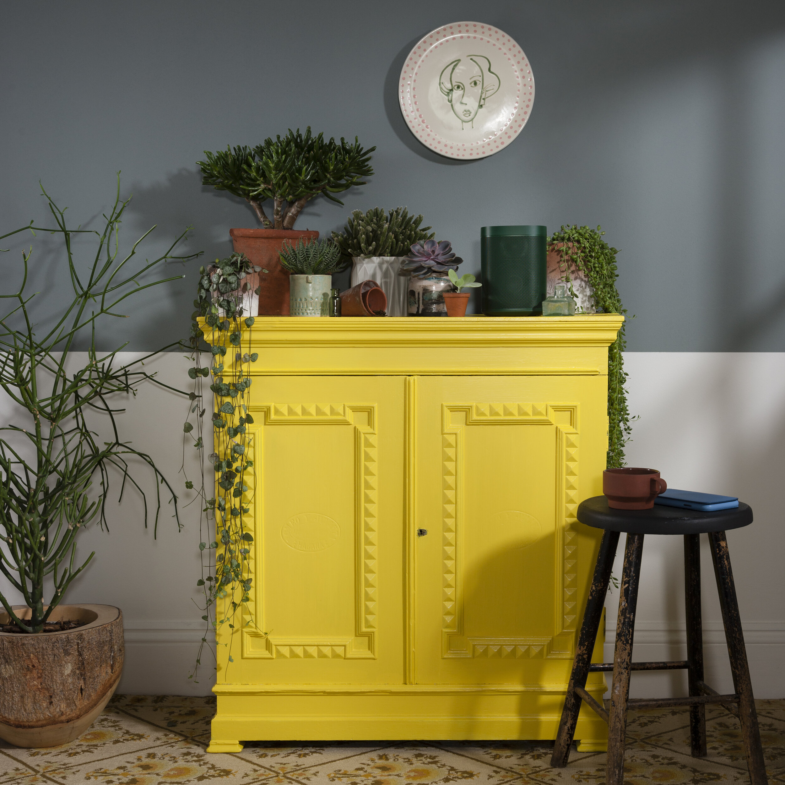
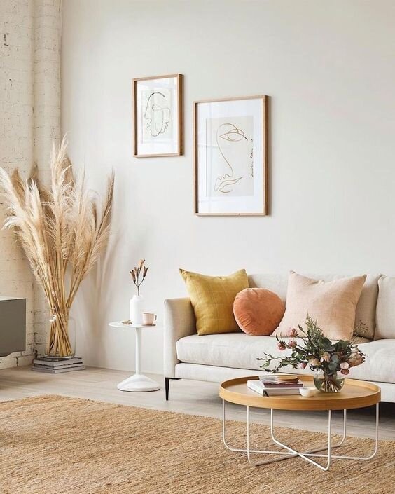
YELLOW – Yellow captures the warmth of sunlight and evokes positivity. It’s a great choice for kitchens, dining rooms and bathrooms, where it is energising and welcoming. Stick with golden shades and use it to brighten darkened corners of your home to create a feeling of light and space. Images: Pinterest, MissPrint, LIV For Interiors.

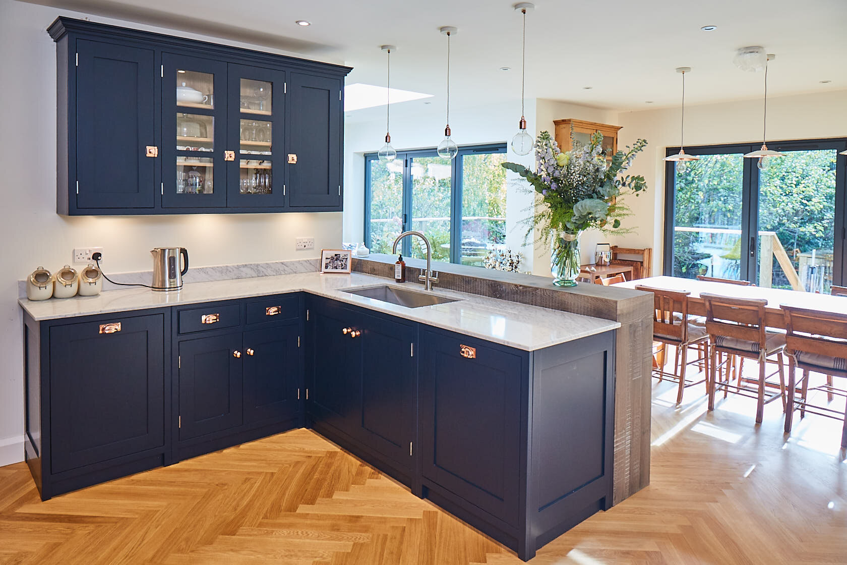
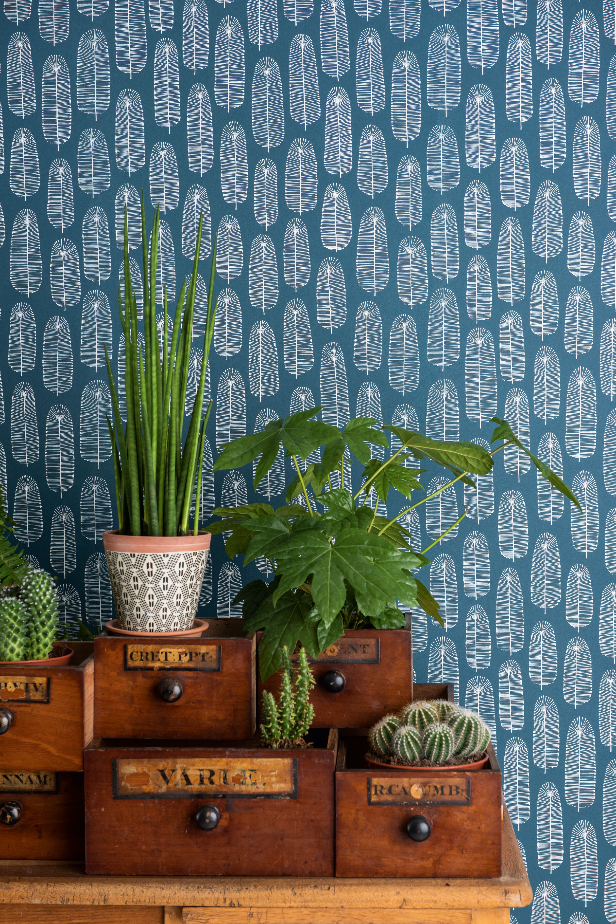
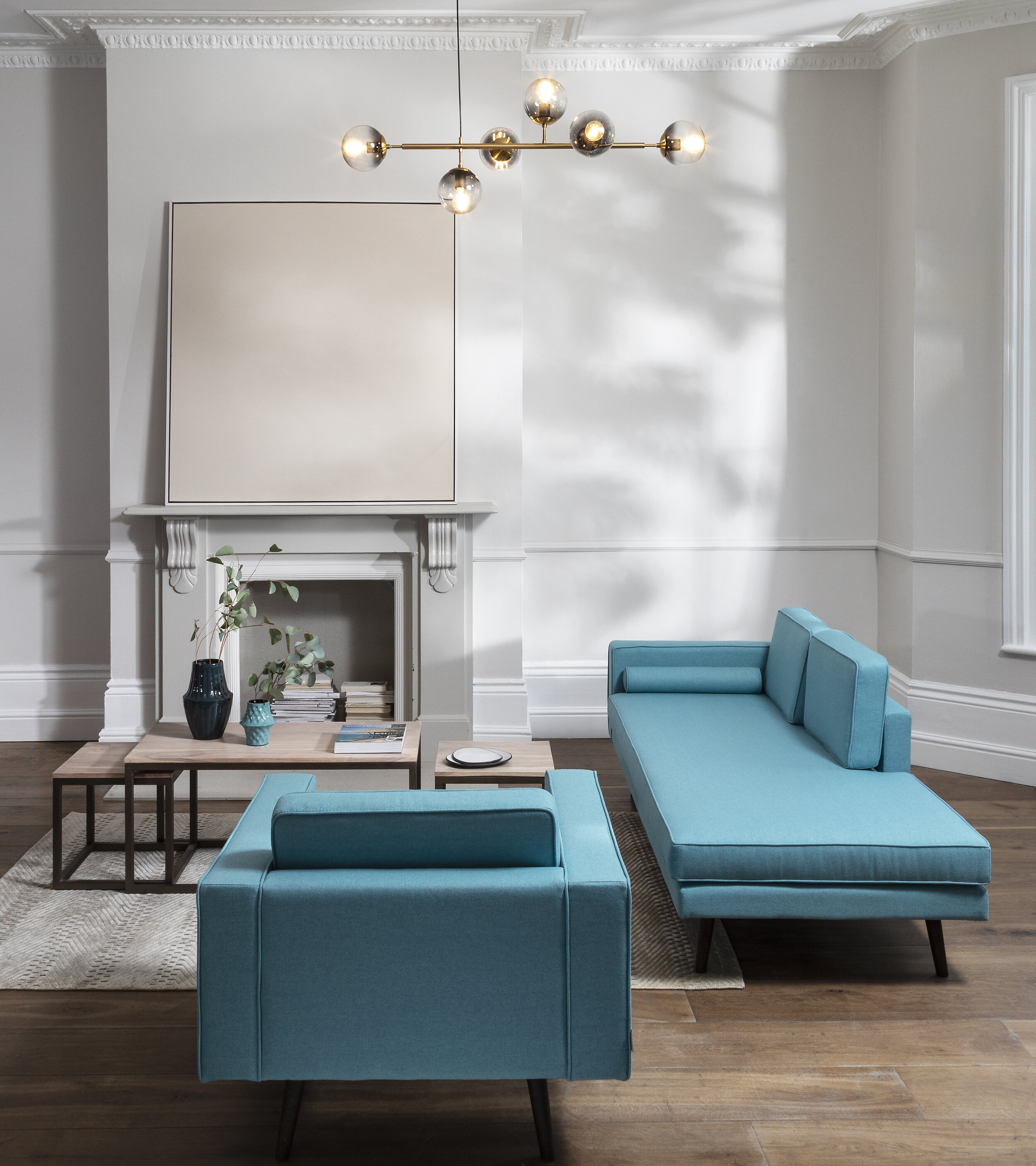
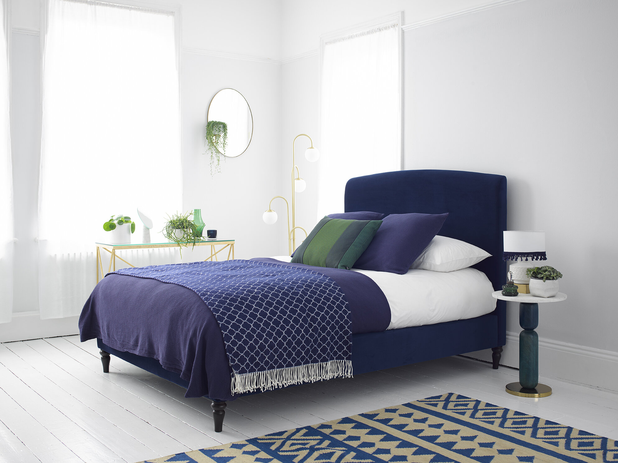
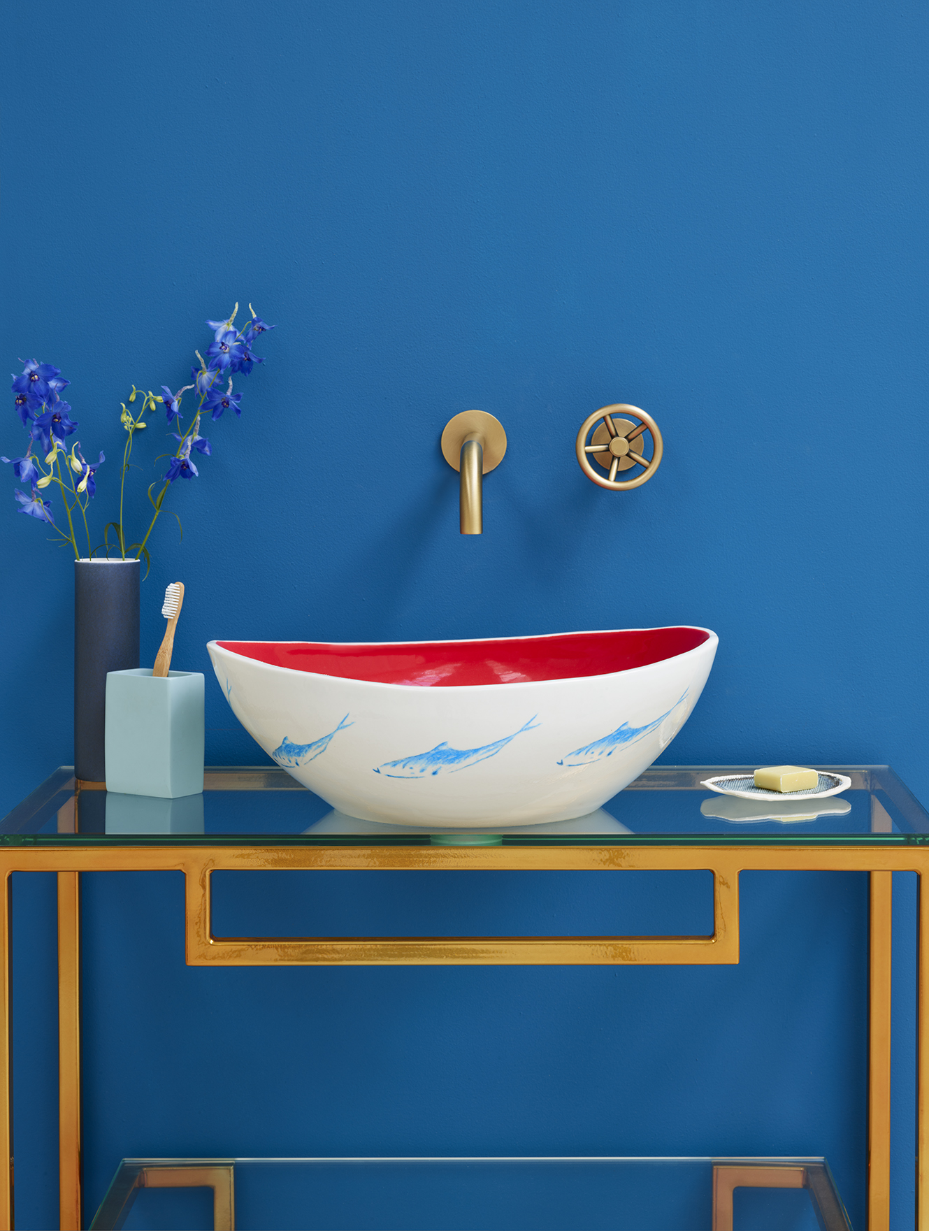
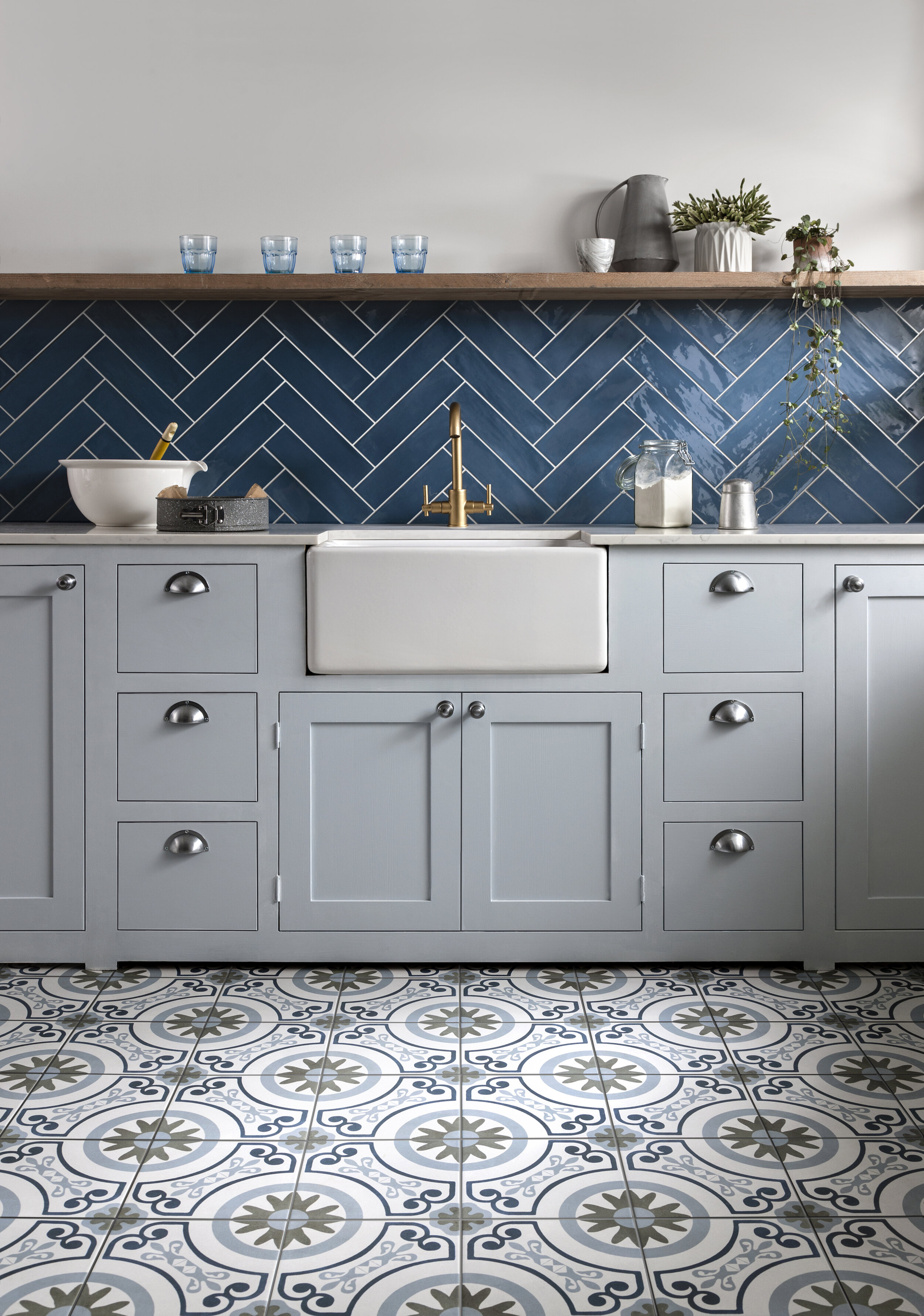
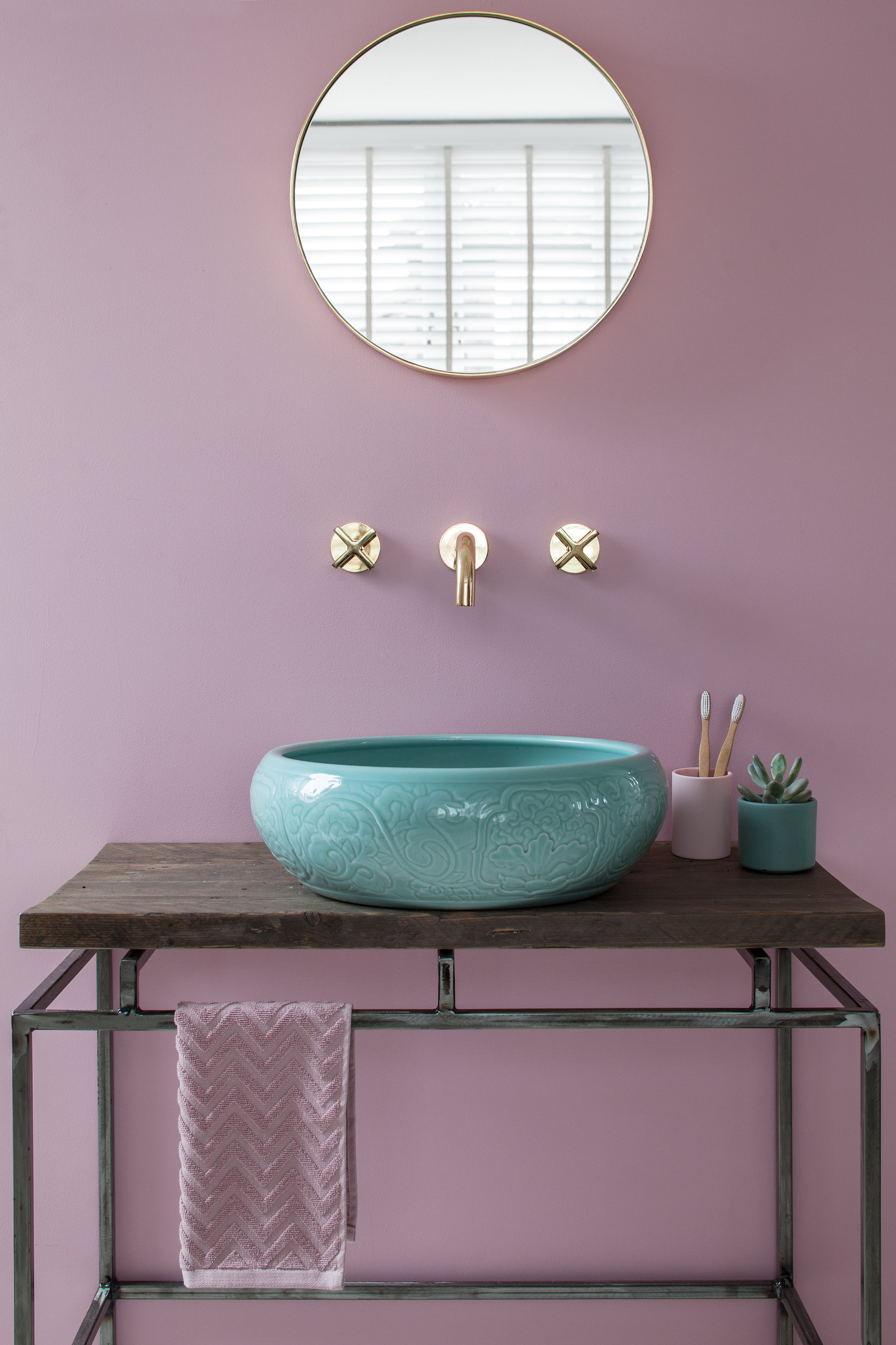
BLUE – One of the strongest hues of the colour psychology spectrum, blue is believed to bring down blood pressure and slow respiration and heart rate. Deep, bold hues are effective at creating a sense of confidence and are linked to traits such as loyalty, trust, peace and success. Considered calming and serene, this colour is often recommended for bedrooms and bathrooms where you want to create a relaxing environment.
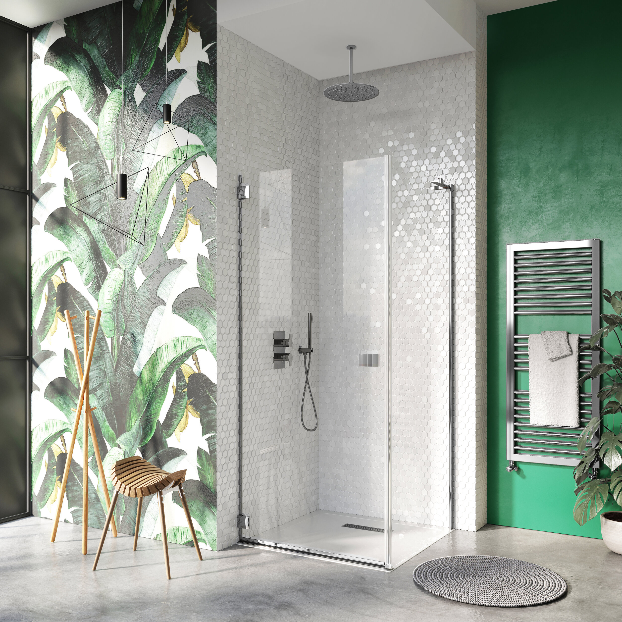
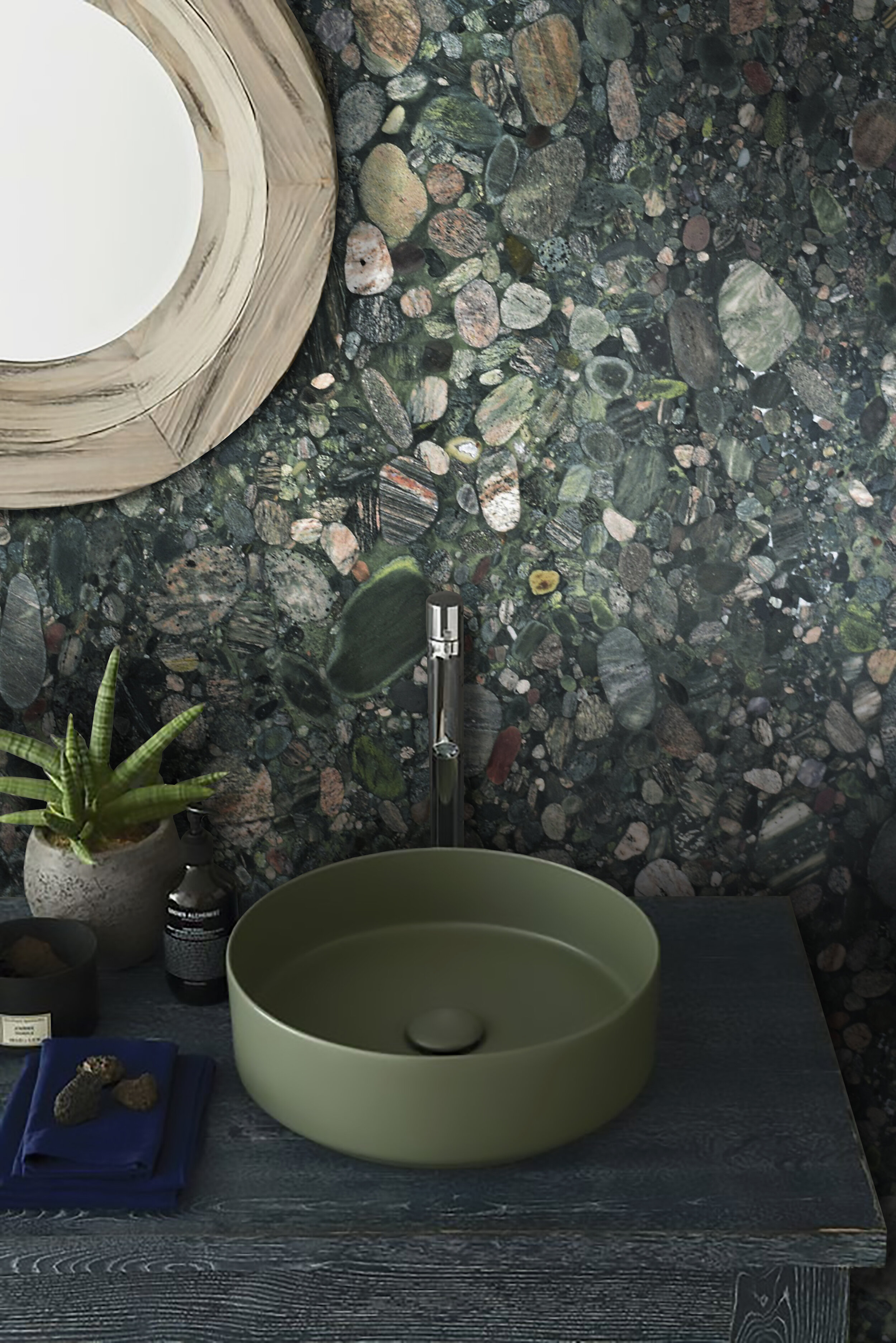
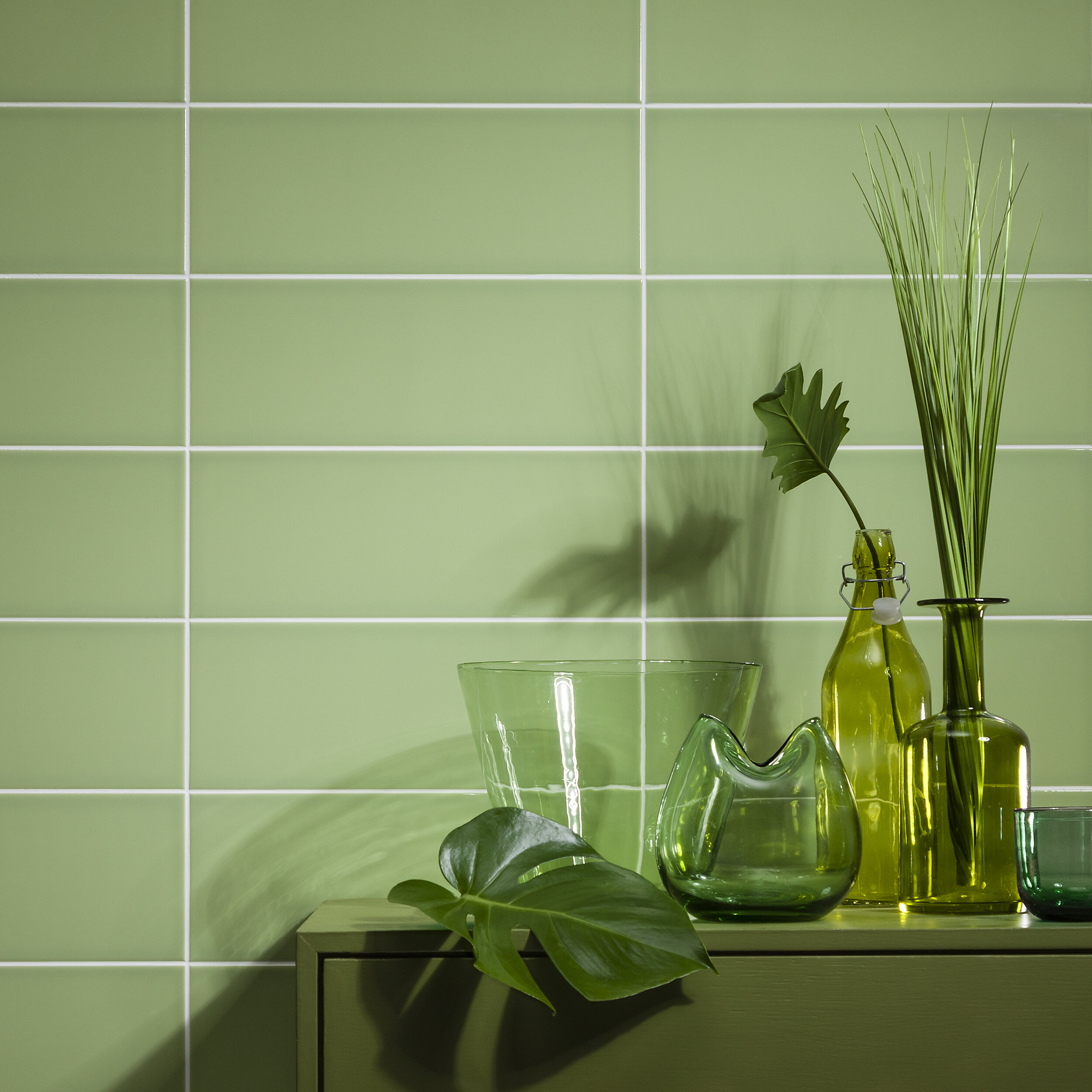
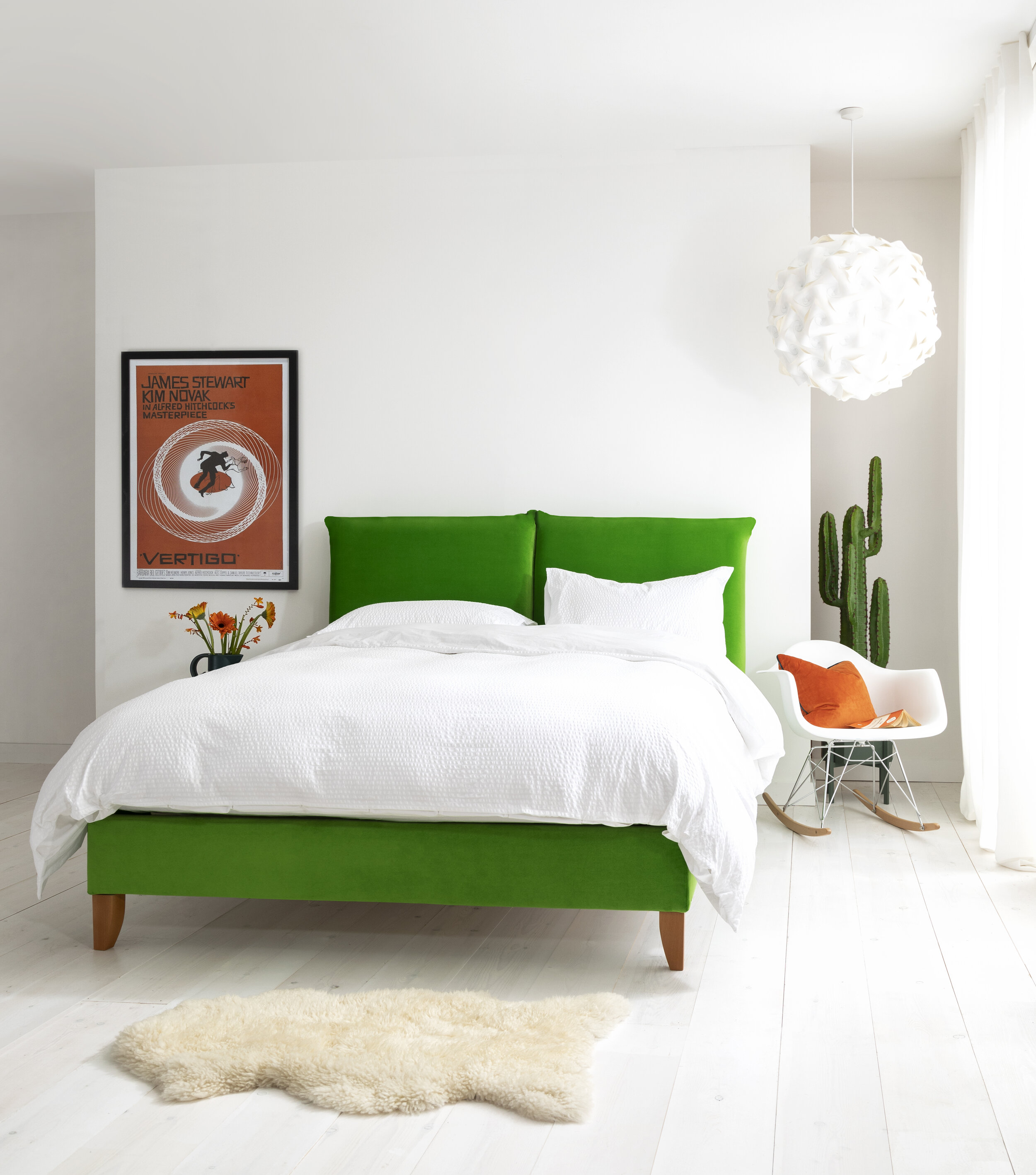
GREEN – Combining the invigorating quality of blue and the optimism of yellow, green is suitable for almost any room in the house. It stimulates thoughts of balance, growth and restoration in colour psychology. It immediately brings the natural world to mind, and encourages unwinding but has enough warmth to promote comfort and togetherness.
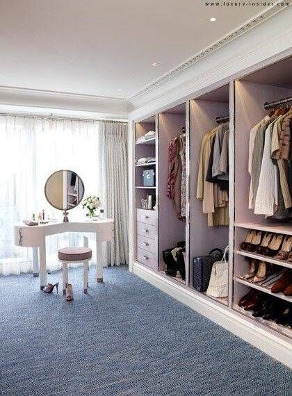
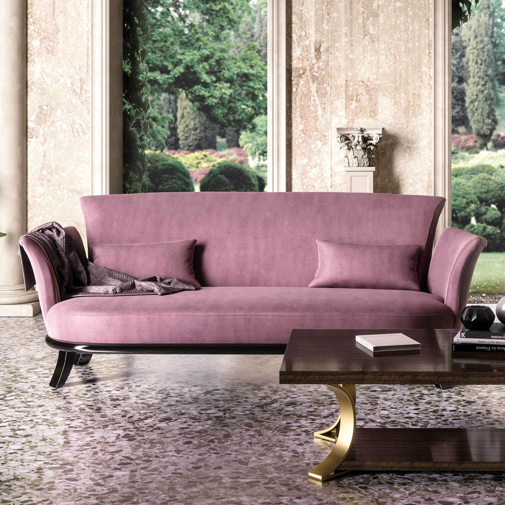
PURPLE – Purple is associated with a range of positive emotions from depth and creativity to fantasy and nobility. It carries a regal charm and suggests luxury, which delivers real presence. Consider using it in a dressing room for maximum effect, or use it in your hallway to impress guests at the first opportunity. Images: Pinterest, Juliettes Interiors, London Basin Company.
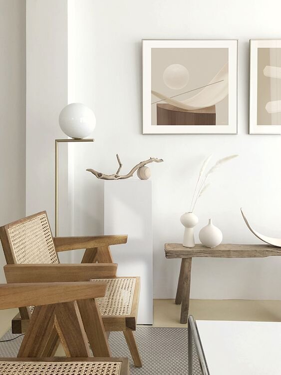
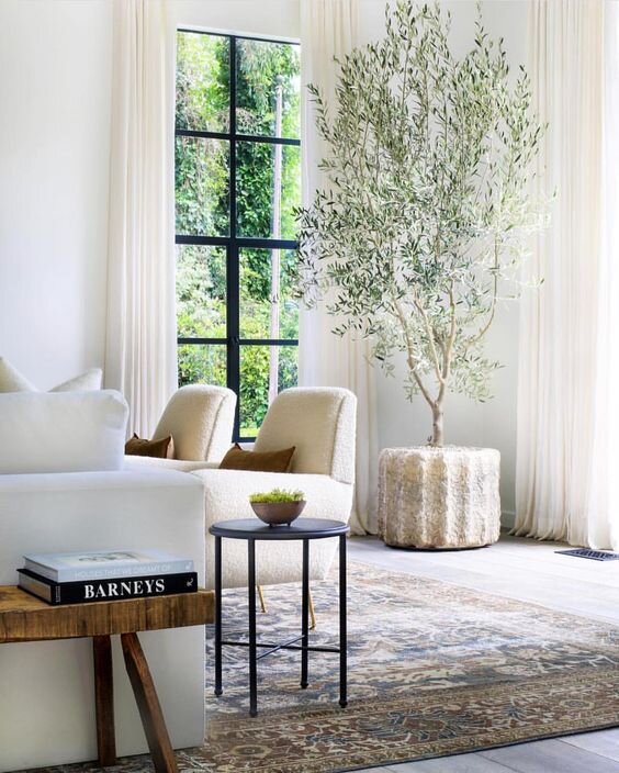
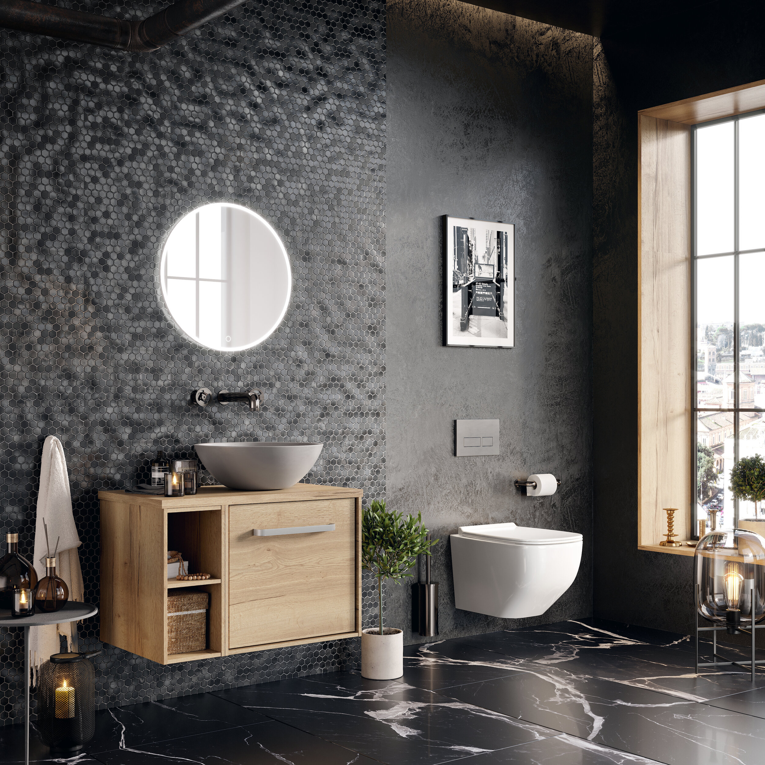
NEUTRALS – Shades such as black, grey, white and brown are vital to the interior designer’s palette. Their virtue lies in their flexibility – add colour to liven things up and remove it for a subtler aesthetic. Grey is one of those versatile colours that can be warm or cool, and can evoke feelings of calm and security. Black’s neutrality gives it a fail-safe quality and creates an elegance that results in power, drama and mystery.
We hope our blog post has helped you to understand the psychology behind your colour choices. For more inspiration, look at magazines, decorating books and websites for ideas and also let your textiles be your guide. We look forward to hearing how you get on!